The Dow Jones Color System
First, Everyone
Had to Agree
How a broken color palette became a standard a dozen brands signed off on — before a single line was automated.
Kevin Muldoon · Design Systems Architect · Farther
1
The Real Issue
The number lied. And so did the name.
NewsKit shipped a clean ramp — blue010 to blue100, light to dark. Then each brand re-themed it, and the discipline broke: hex values were dropped in with no regard for the weight number, so it stopped predicting anything. Worse, the color was named for what it was — “blue” — not what it did. A token called blue can’t hold Barron’s navy or MarketWatch’s green. It needed to be primary.

Left, the clean ramp. Right, after theming: green080 is lighter than blue070 — and it’s called green though it’s blue.
2
The Fix — Genome
The drift wasn’t carelessness. The designers had no tool.
They were hand-typing hex because nothing generated a proper ramp. So I built one: Genome — feed it a brand color and it produces a perceptually-even scale, indexed to CIE L* and named by role, so one token carries any brand’s hue. I studied every major system to build one that could express them all.
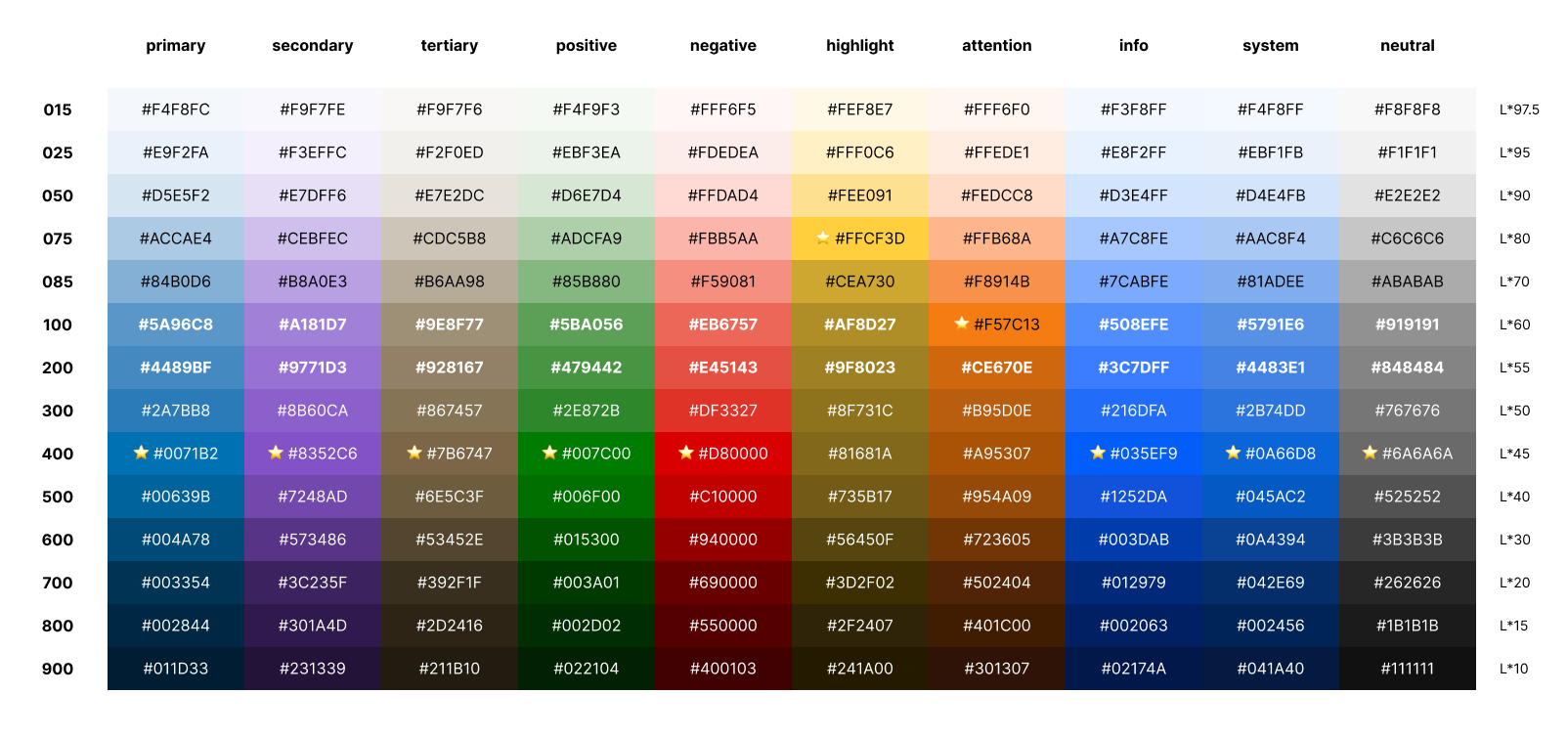
Ten semantic roles, every weight indexed to L*. “Normal” anchored at 400 — borrowing CSS’s font-weight convention. Hold that thought.
3
The Real Obstacle
You Can’t Automate a System
Built Non-Systematically.
Bespoke solutions require bespoke reviews.
Every hand-picked hex is a one-off — and a one-off can only be checked one at a time, by hand, forever. You can’t automate that. Before any pipeline could touch the palette, it had to become systematic: weights chosen by rule, not by taste. And because it’s a white-label system, systematic meant one thing — every brand agreeing to the same meaningful weights.
4
Who Had to Say Yes
Four decision-makers, and the portfolio follows.
The brands didn’t each hold a veto. It came down to four people — the VPs and directors who owned them between them. Win those four, and every brand below moves. So the whole thing rested on making the case to four.
✓ The Wall Street Journal
✓ Barron’s
✓ MarketWatch
✓ Financial News London
✓ Mansion Global
✓ Factiva
✓ Penta
✓ MarketSurge
✓ WSJ Pro
✓ BuySide
✓ Risk & Compliance
✓ … and more
5
Making the Case
I showed them the drift. The case made itself.
I didn’t have to campaign. I put the L* drift on screen — each decision-maker watching their own palette’s numbers stop meaning anything. They already knew a white-label system needs semantically meaningful weights, or theme-swapping breaks at scale. Once the problem was undeniable, agreement was fast: all four signed within three months.
The system was adopted because the people who owned the brands chose it — not because anyone was told to.
6
Before Any Automation
This Came First.
Before Style Dictionary. Before a single token was compiled. Before any of the automation that let the system scale to twenty brands and five platforms — there was this: agreement. You cannot compile a standard nobody signed. Every architect wants to jump to the tooling; the tooling is worthless without the consensus beneath it.
The hardest, least glamorous, most important work happens before the code.
7
The Result
One color standard, adopted across the brands.
With consensus in hand, the brands moved onto a shared, accessible, perceptually-honest color foundation. Only then could the automation follow — the tokens, the pipeline, the five platforms. The agreement is what made the scale possible. The code was the reward for the diplomacy, not a substitute for it.
Adoption you can defend: not a metric handed to me, a consensus I collected.
8
A Confession
And then I realized I was wrong.
Genome shipped, and it worked — the brands themed reliably and the accessibility decisions scaled. And then I realized I’d made one wrong call. I anchored “normal” at weight 400, because CSS does — where font-weight: 400 means “normal.” I’d borrowed the convention without questioning it. But the history of font-weight naming is a mess, and 400 isn’t the perceptual center of anything. L*50 is.
9
The Better Standard — Univers
So I moved the number to where it tells the truth.
500 — the true center of a 000–999 scale, and exactly L*50: the one value that clears 4.5:1 on both white and black. I named the refined standard Univers — after Frutiger’s typeface, where systematic weight-numbering began.
| | Weight | L* | On white | On black | Safe text |
|---|
| 100 | 95 | 1.1:1 | 18.6:1 | black |
| 300 | 79 | 1.7:1 | 12.0:1 | black |
| 500 | 50 | 4.5:1 | 4.7:1 | either |
| 700 | 30 | 9.3:1 | 2.3:1 | white |
| 900 | 11 | 16.9:1 | 1.3:1 | white |
10
The Complete Scale
Twenty-two weights. The famous systems kept fewer.
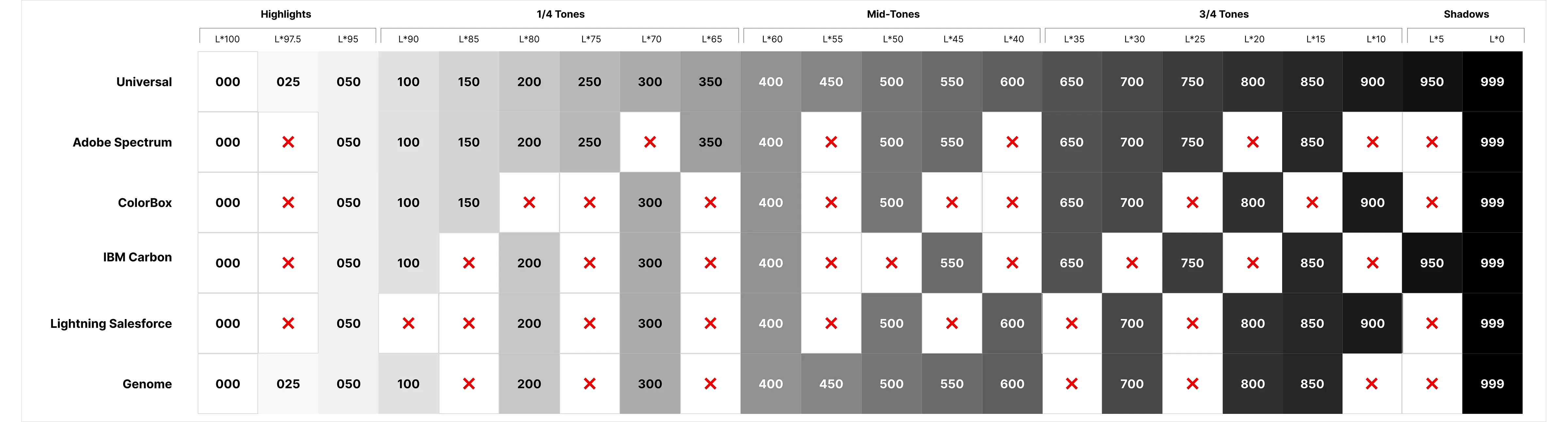
Spectrum, Carbon, Salesforce, ColorBox — each dropped notes from the scale. A universal standard can’t afford gaps: it has to hold any brand’s color, at any lightness. Univers keeps all twenty-two.
11
The Point
I updated my own standard the moment the evidence
demanded it. The goal was never to be right —
it was a color standard anyone could adopt, anywhere.
A design system is a system of truth. So is the standard beneath it.
12